Professional Website for Midwives
Freelance midwives work personally, regionally and often with limited capacity. A strong website therefore does not need loud selling. It needs orientation: Which services do you offer? Which area do you cover? When does an enquiry make sense? We build calm, fast websites for midwives, midwifery practices and small teams - with clear structure, trust-building imagery and data-minimising contact paths.
Why midwives need their own website
Many expecting parents search under time pressure: midwife nearby, postpartum care, birth preparation, postnatal exercise, breastfeeding counselling or available capacity in a specific period. Recommendations, midwife lists and health-insurance searches help people find names, but they rarely explain enough. Your own website is the place where you control your work, service area and contact path yourself.
This matters especially for freelance midwives. If you work alone or in a small team, you cannot clarify every unsuitable enquiry by phone. The website should show in advance which locations you cover, which services you offer, how enquiries work and when support is realistic. That leads to better-fitting enquiries and fewer repeated questions.
The website does not have to be large. A calm, well-kept foundation with clear pages is often stronger than an overloaded system. What matters is that parents quickly gain trust, find the key information and can make contact without friction.
What expecting parents need to know before first contact
On midwife websites, the decision does not start at the contact form. Many visitors first check whether an enquiry makes sense at all: Does the home address fit? Does the expected birth period fit? Is postpartum care available? Are courses, home visits or breastfeeding counselling offered? The more clearly the website answers these questions, the less has to be sorted out by phone later.
At the same time, the page should not feel like a form for medical details. A strong midwife website builds trust without asking for intimate information too early. It explains the process: which details are enough for an initial assessment, when a response is realistic and which topics are better clarified in direct conversation or through the existing professional path.
That makes the website especially valuable for solo midwives. If you work alone, you do not need a large digital administration system. You need clear pre-qualification: suitable families should quickly understand whether they are in the service area and how they can start with a concise, respectful enquiry. Mismatched enquiries are not rejected harshly, but good information reduces them significantly.
Service area and availability as the core of the website
For midwives, the service area is not merely an SEO detail. Home visits, postpartum care and courses depend on travel time, routes, calendars and capacity. The website should therefore name towns, districts, postcodes or a radius clearly. If some areas are possible only by arrangement, that should also be visible.
Availability is the second central point. Not every midwife can or wants to maintain a constantly updated calendar. A simple section still helps: enquiries possible for specific months, currently no postpartum capacity, courses from a certain period or response within a few working days. This takes pressure out of the first contact.
For local visibility, we connect clear visible content with clean technology: understandable location wording, consistent contact details, fast mobile delivery and structured data where it fits the website. This is not a promise of specific positions, but a solid foundation for people and search engines.
The language around capacity also matters. "Currently fully booked" is often too vague for parents. A maintainable explanation is better: postpartum care again from a certain month, courses with fixed start dates, home visits only in certain districts or responses only for suitable timeframes. Communication remains friendly while still being realistic.
If availability changes very often, we do not plan the section as a fixed promise. A short note that can be updated quickly is more useful. The website should relieve the midwife, not create a new maintenance duty that gets lost in daily work.
Which content belongs on a midwife website
The homepage answers the most important questions quickly: Who are you? Which services do you offer? Where do you work? How can expecting parents contact you? A calm image, a clear headline and a few direct paths work better here than a long welcome sentence.
The services page structures pregnancy support, prenatal care, postpartum care, breastfeeding counselling, postnatal exercise, birth preparation and courses factually. Not every midwife offers everything. That is exactly why clear boundaries matter: What is part of your offer, what is not, and when do you refer to other places or professionals?
The About or team page is especially important for midwives. Parents decide strongly through trust. Training, professional experience, additional qualifications, working style, languages, course formats and personal approach should be described concretely but without overstatement. A real portrait or calm practice image supports this context.
The contact area should work immediately on mobile: phone, email, enquiry path, service area, response time and, if needed, a note on which information helps with an initial assessment. If a form is used, it remains deliberately short and does not request unnecessary sensitive health details.
For courses, a clear overview is often enough instead of a complex system: course type, audience, location, timeframe, free places only if that information can be maintained, and a clear enquiry or registration path. If an external course or appointment tool already exists, the website can link to or embed it. The website itself remains the calm information frame.
Required pages and trust signals should also work together. Imprint, privacy information, contact details, qualifications, memberships, continuing education and notes on professional review should not be hidden. In a health-related context, trust comes from concrete, reviewable information - not from large promises.
From website visit to suitable enquiry
The website should guide first contact as a calm path. Services, location and availability come first. Then person, working style and process. Only then comes the enquiry. This order is especially important for midwives, because parents often open several pages in parallel and quickly decide which enquiry is worth making.
A good enquiry area does not ask for everything that may later become professionally relevant. For first sorting, a few details are usually enough: name, preferred contact path, town or postcode, expected timeframe and a short neutral message. Diagnoses, reports, files, insurance numbers or detailed health stories do not belong in a simple website form.
A clear expectation frame belongs here too. If responses are only possible at certain times, that should be visible. If enquiries without a matching postcode or outside the supported timeframe cannot be answered, the website can explain this politely. That is more honest than an open contact surface that later creates frustration on both sides.
For small teams, a simple task split can also be visible: who handles postpartum care, who handles courses, who handles breastfeeding counselling, who answers general enquiries? This does not have to become organisationally complicated. It is enough if visitors quickly understand which path fits their situation.
Courses, appointment paths and sensitive data with clear boundaries
Many midwives offer courses or work with external course rooms, family centres or digital booking paths. A course offer can be presented very clearly on the website: topic, timeframe, location, target group, contact path and a link to an existing course or appointment widget. If an external system is used, the contract and data processing remain with the respective provider and the midwife.
We do not build custom course portals, payment systems or patient accounts. For small midwife websites, that is usually too heavy and creates unnecessary responsibility for payment and health data. Instead, we design a clean interface that links or embeds existing tools and makes contact understandable.
We plan contact forms with data minimisation in mind. A town or postcode can be important for the service area, an expected period for capacity. Detailed medical information, reports, files or sensitive health stories do not belong in a casual website form.
Local visibility without artificial keyword pages
Midwives are almost always searched for locally. Still, the website should not consist of artificial location lists. Good local visibility comes from real visible information: supported towns, districts or postcodes, clear service areas, consistent contact details, fast mobile delivery and understandable headings.
If several locations are supported, they can be integrated naturally into the text. A sentence such as "I support families in these districts and, by arrangement, in neighbouring areas" is more valuable for visitors than a long list without context. Search engines benefit too, because location, service and contact logic appear in a readable context.
Local visibility also includes the midwife maintaining external search and map profiles herself. The website can act as the central reference: same contact details, same service description, same availability logic. We do not promise placement, but we build the technical and editorial foundation so people and search systems can understand the page cleanly.
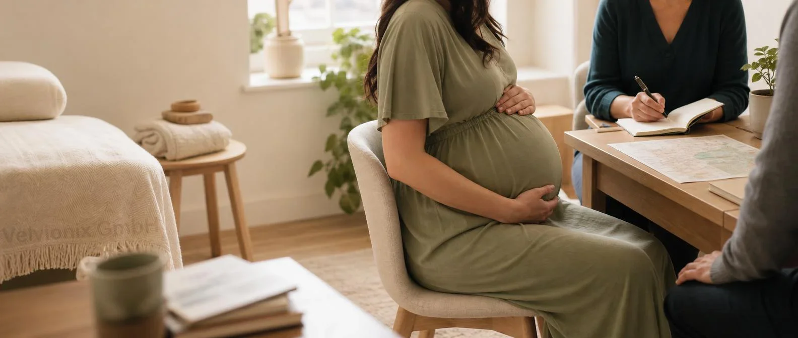
Imagery, trust and accessibility-aware design
Midwife websites need different imagery than many classic practice websites. The key is not medical drama, but support: calm consultation situations, pregnancy, home-visit organisation, course rooms, a trustworthy working environment and clear orientation. Faces can feel personal, but they must be used deliberately and with consent.
For a professional page, we plan motifs that make midwifery immediately recognisable without showing birth scenes, emergencies or intimate situations. A pregnant person in consultation, hands, materials, a calm room or subtle service-area planning can point in the right direction. The imagery should be warm, but not sentimental.
Accessibility-aware design is not a technical extra here. Many parents search on mobile, at night, tired or under pressure. Large contact areas, clear contrast, short sections, understandable language and fast loading times help directly. They also strengthen the website's quality signals for search engines and AI systems because the page becomes easier to read and better structured.
Professional and legal context without false promises
Midwife websites quickly touch professional and legal topics: the German Midwifery Act, the midwife care contract under § 134a SGB V, professional information, privacy, health-related communication and imprint duties. These topics can be placed in context on the website, but not as individual advice or outcome promises.
We prepare content factually and in a reviewable way. Service descriptions stay calm, clear and without overstated efficacy claims. Whether specific wording, required information or privacy texts are appropriate in the individual case remains with the midwife, professional association, data protection advisor or specialised legal counsel.
Accessibility-aware design is especially useful for midwife websites because parents often use the website on mobile, tired, under time pressure or with many open questions. Good contrast, clear language, large contact paths and fast loading times help real people as well as search engines.
The same applies to sources and professional details. If services, contracts, billing notes or professional information are mentioned, they should be written factually and reviewed before publication. The website creates the structured place for this; it does not replace review by a professional association, data protection advisor or specialised legal counsel.
Frequently asked questions about websites for midwives
Which pages does a midwife website need at launch?
For launch, homepage, services, About or team, service area, contact and required legal pages are often enough. If courses, postnatal exercise, birth preparation or breastfeeding counselling are important, these topics can be planned as dedicated sections or compact subpages.
Should a midwife show availability online?
Yes, if the information can be maintained. A short note on free or limited capacity, months currently accepted or enquiry windows helps expecting parents and reduces mismatched enquiries. If the situation changes often, we plan the section so small updates remain easy.
How should the service area be shown?
Midwives often work with fixed towns, postcodes, travel times or a radius. The website should name this area clearly and explain when exceptions are possible. For search engines, parents and route planning, this is more important than a generic service description.
Can the website include a contact form?
Yes, but deliberately lean. For a first enquiry, name, contact path, town or postcode, expected timeframe and a short neutral message are usually enough. The input is sent by email directly to the midwife mailbox; permanent storage on our systems is not intended.
Does Velvionix build a custom course or booking system for midwives?
No. If an existing course, calendar or appointment booking widget is already used, it can be linked or embedded. We do not build custom course, payment or patient portals. For small teams, a clear enquiry path is often the more robust solution.
What does a website for midwives cost?
We offer compact Starter packages for professional websites. All packages, care tiers and optional extensions are listed transparently on our Website pricing & packages page - so you can compare scope and pricing at your own pace, with no obligation. In a no-obligation conversation we clarify which setup fits your online presence.
More dedicated services in this industry
Looking for a website for a related profession? These dedicated pages might also be relevant:
Website for Physiotherapy Practices
Structure services, treatment focus areas, team, consultation hours, location, insurance notes and appointment requests clearly - for physiotherapy practices that want to inform factually and be found more easily locally.
View physiotherapy website →Website for Naturopaths
Present methods, qualifications, process, cost notes, limits, contact paths and appointment requests factually - for naturopathy practices that want to build trust without exaggerated claims.
View naturopath website →Website for Psychotherapy Practices
Present therapy offer, qualifications, process, waiting times, first contact and notes for initial contact calmly and clearly - for practices with a particularly sensitive audience.
View psychotherapy website →Website for Occupational Therapy Practices
Explain target groups, treatment areas, process, prescription requirements, team, location and contact paths clearly - for occupational therapy practices with different patient groups.
View occupational therapy website →More relevant industries
What We Have Already Delivered
Our reference project shows a custom website with a multilingual structure, animated landing page, interactive map and automatic contact form - built from scratch instead of a website-builder template.
View reference project →Full details on scope, packages, prices and optional extensions can be found on our Web Development services page.
View packages and extensions →Ready for a website that fits your midwifery work?
In a free initial consultation we clarify services, service area, availability logic, course offers, visual direction and contact paths. You receive a concrete offer for a professional presence that gives parents orientation and reduces repetitive enquiries.
Discuss your midwives website