Professional Presence: How to Build a Website That Pays Off
Build a professional website on a small budget by prioritizing content, trust, maintenance and inquiry quality.
Published: · Updated:
 © Velvionix
 Key Takeaways
Why “Professional” Mainly Means “Prioritized”
Many freelancers and small businesses automatically associate “professional” with “expensive.” That leads to two bad decisions: either the website keeps getting postponed because the perfect budget is not there yet, or the available budget goes into surface polish while the offer, contact path and trust signals stay unclear.
Both cost money. No website costs visibility and trust. A polished but unclear website costs qualified inquiries. The decisive question is therefore not how large the first version is, but whether the most important decisions are made in the right order.
When the budget is limited, the website should not try to do everything at once. It should first answer: Who is this offer for? Which problem does it solve? Why is the provider credible? How does someone get in touch? Everything else belongs in a later expansion.
The First Seconds Must Create Orientation
Visitors rarely arrive on a website in a relaxed mindset. They compare, scan, check and decide quickly whether to stay. A professional website helps them avoid guessing.
This starts at the top of the homepage. If there is only a generic statement, the visitor still has to work out whether the offer fits. If it clearly says who the service is for, what outcome can be expected and what the next step is, the page immediately feels calmer.
If you work locally and appointments are the goal, the path to an appointment must be visible. If your service needs explanation, the page needs precise statements instead of long marketing language. If you serve several audiences, the most important one should appear first instead of addressing everyone equally loudly.
Spend Your Budget Where Decisions Happen
The most important budget principle is uncomfortable but true: You’re not buying a “website.” You’re buying clarity, trust, and a clean path to inquiry or appointment. Everything that doesn’t support this goal is luxury, even if it looks slick.
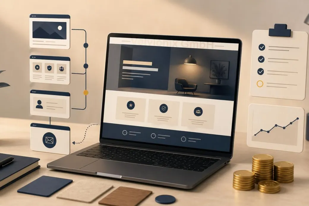
For the first version, a few pages are often enough: homepage, services, about us or about me, references or examples, contact and required legal pages. These pages do not have to be long. They have to be clear.
The homepage sorts. The services page explains. The contact page makes the next step easy. The about page builds familiarity. References or examples show that the offer is not only claimed. A clean version of this core structure is worth more than ten additional pages that no one maintains later.
Search engine optimization starts here as well. Google describes SEO not as a trick, but as helping search engines and users understand content. A small website can therefore compete when it is clearly structured, answers real questions and does not try to look bigger through many thin pages.
Trust Comes from Proof, Not Decoration
Trust comes from visible care. That includes clear service descriptions, current content, real photos or credible illustrations, understandable processes, concrete examples and a contact option that is not hidden.
This does not have to be expensive. A real photo from the business can be stronger than interchangeable stock imagery. A short “how working together works” section can create more trust than a long sales text. Two concrete examples can be more useful than a broad claim such as “high quality.”
If you do not yet have large references, show smaller forms of proof: typical questions, working process, qualifications, before-and-after process without exaggerated promises, clear boundaries of the offer. Professional does not mean pretending to be larger than you are. Professional means appearing reliable and concrete.
Ongoing Costs Decide Whether the Website Stays Affordable
The biggest budget risk is often not the launch, but daily operation. Every additional function can later become a subscription, a disruption, a privacy question or a maintenance task. The more building blocks are involved, the more expensive each small change becomes.
If an element does not support trust, orientation or contact, it should not be in the first version. If an external tool is added only because it feels modern, restraint is usually cheaper. If content needs to change regularly, the website needs a structure that makes those changes easy.
Speed and accessibility are part of the cost question too. A slow or hard-to-use website does not only cost patience, but also inquiries. A fast, clear and readable website can feel high quality while staying technically lean.
Case Study: Studio with Small Budget
A small studio wanted to look more professional, but only had budget for a lean first version. Instead of a complete rebuild, three things were fixed properly: a clear homepage, understandable service descriptions and a contact page with an easy appointment path. Real photos from the studio and two short examples of how a first appointment works completed the foundation.
The result was not a magical doubling of visitors. The more important effect was that inquiries became more fitting. Prospects understood faster whether the studio was right for them and asked fewer basic questions. That is the value of a budget-friendly website: it sorts better, instead of only looking nicer.
The Real Effort - Unvarnished
Even a lean website needs maintenance. Services change, prices or packages are adjusted, opening hours or availability shift, examples are added. Ignoring this slowly erodes trust.
The difference is predictability. A lean website can be checked briefly and expanded deliberately. An overloaded website quickly becomes a permanent construction site. That is why a small, clean start is often more professional than a large launch that already feels outdated after three months.
What Endangers Budget and Impact
Common Questions About Budget-Friendly Websites
Does a professional website have to be expensive?
No. It often gets expensive through the wrong order, too many features and later maintenance problems. A lean, clear website can look very professional.
What brings the most impact if I can only invest a little?
Homepage, services page and contact page. These three decide whether visitors quickly understand if the offer fits and how they can inquire.
How many pages do I need to start?
Few but strong. Homepage, services, about us or about me, references or examples, contact and required legal pages are often enough for the first version.
What's the most common reason websites don't pay off?
Unclear value and no obvious next step. Visitors do not understand why they should stay or how they can get in touch.
Should I improve design or text first?
Text and structure first, design directly after that. Design reinforces clarity, but it cannot replace missing statements.
How can I build trust when I have few references?
With real examples, clear processes, qualifications and concrete statements. Show tangibly what collaboration looks like and what customers can expect.
How do I keep the website affordable in daily operations?
Stay lean, use only justified features and briefly review content regularly. This avoids unnecessary subscriptions, repairs and outdated statements.
Look Professional Now - Without Burning Budget
If you want to solve this topic properly, we implement it as part of our services in a structured way - not as a loose individual measure. Please use the contact form and select the appropriate options. We will get back to you with a brief assessment of the most sensible approach.
Sources
Notice: The respective providers or operators are solely responsible for the content of external links.
- [1] Nielsen Norman Group : "Growing a Business Website: Fix the Basics First"
https://www.nngroup.com/articles/design-priorities/ - [2] Nielsen Norman Group : "Trustworthiness in Web Design: 4 Credibility Factors"
https://www.nngroup.com/articles/trustworthy-design/ - [3] Stanford University : "The Web Credibility Project: Guidelines"
https://credibility.stanford.edu/guidelines/index.html - [4] Google Search Central : "SEO Starter Guide: The Basics"
https://support.google.com/webmasters/answer/7451184 - [5] Google Search Central : "Creating Helpful, Reliable, People-First Content"
https://developers.google.com/search/docs/fundamentals/creating-helpful-content - [6] web.dev : "How Can Performance Improve Conversion?"
https://web.dev/articles/how-can-performance-improve-conversion - [7] W3C Web Accessibility Initiative : "Easy Checks - A First Review of Web Accessibility"
https://www.w3.org/WAI/eval/preliminary.html


Comments
No comments yet.
Be the first to comment!
Write a comment
To write a comment, please enable the comment function in your privacy settings.
Write a comment