Accessibility That Helps Everyone: Usable, Credible, More Inquiries
Accessibility improves readability, forms, and trust - and prevents good prospects from dropping off along the way.
Published: · Updated:
 © Velvionix
 Key Takeaways
Why Good Websites Still Lose Inquiries
Many websites lose prospects not because their services are weak, but because of small barriers. Text is too light, buttons are too small, forms are unclear, error messages are not helpful. The person who built or has seen the website many times may barely notice. Visitors notice immediately.
This does not only affect people with permanent disabilities. A website also becomes difficult when someone is on a smartphone, has little time, is in poor lighting, has only one hand free, or wants to scan content quickly. In those moments, the prettiest design matters less than whether the next step works without thinking.
Accessibility is therefore not a side topic. It is a quality filter for the entire website. When important information is reliably readable and contact paths work cleanly, the presence feels more credible and more people make it through to an inquiry.
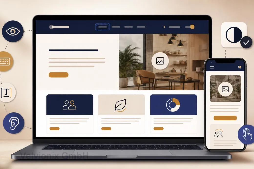
What Accessibility Means in Practice
WCAG describes accessibility through four core principles: content should be perceivable, operable, understandable, and robust. For small business websites, this translates into very concrete work.
Perceivable means: text has enough contrast, content is not only present in images, images have meaningful alt text, and important notes do not disappear in tiny gray side remarks. Operable means: navigation, buttons, and forms work with keyboard, touch, and different devices. Understandable means: visitors know where they are, what they should do, and what happens after an inquiry. Robust means: the website is technically clean enough for browsers and assistive technologies to interpret it reliably.
This sounds standards-driven, but in daily use it is practical. A clear heading helps a screen reader. It also helps a hurried smartphone visitor. A well-labeled form helps people using assistive technology. It also helps everyone who wants to request an appointment quickly.
The Most Important Levers for Small Websites
The first lever is readability. Many modern designs feel elegant until real people use them: font too small, contrast too low, lines too long. Good readability is not a design compromise. It is the foundation for understanding the offer.
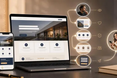
The second lever is structure. People scan online. They look for services, process, price range, trust, and contact. Clear H2 headings, short paragraphs, and distinct page sections help everyone reach a decision faster.
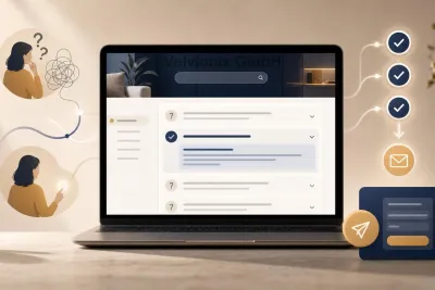
The third lever is interaction. Buttons need to look like buttons. Focus states must remain visible. Menus must not work only on hover. Forms need clear labels, understandable required fields, and error messages that explain what to do.
The fourth lever is content. If a service is explained only in a graphic, the text is missing. If an icon alone carries an important statement, context is missing. If an image is decorative, it should not pretend to be essential information.
Legal Context Without Panic
With the European Accessibility Act and Germany’s Accessibility Strengthening Act (BFSG), accessibility is becoming more relevant for private providers as well. Whether a specific website is affected depends on the offer, the service, and further details. Broad claims are not helpful here.
For small businesses, the better question is: what should work well anyway? Readable content, understandable forms, clear contact paths, and robust interaction are useful regardless of a specific obligation. If legal requirements also apply, a cleanly built website is already much better prepared.
For a binding assessment of your specific case, legal review remains useful. Technically and editorially, however, much can be prepared: fewer special cases, clear components, real text instead of image-only information, and a contact path that is easy to follow.
Case Study: More Complete Appointment Requests
A small practice had a website where the appointment path existed but was hard to use on mobile. Buttons were tight, required fields were unclear, error messages explained nothing, and the next step after submitting was not obvious.
After the revision, the contact path became shorter and calmer. Fields received clear labels, error messages became understandable, readability improved, and important information appeared as text on the page. The result was not a spectacular new feature, but less friction: fewer follow-up questions, more complete appointment requests, and a more professional impression.
The Real Effort: Start Small, Stay Consistent
Accessibility does not have to be a large relaunch project. A sensible starting point is where visitors make decisions: homepage, service pages, contact, appointment, form. That is where checks for contrast, structure, keyboard use, form labels, error messages, and understandable text pay off first.
Realistically, accessibility is not once and done. New images need alt text or intentionally empty alternatives. New sections need clean headings. New forms need labels and error messages. New colors need enough contrast again. That is why a short accessibility check should be part of every larger content change.
What Undermines Accessibility
Frequently Asked Questions About Accessibility
Does accessibility help if my customers do not have disabilities?
Yes. Good readability, clear structure, and simple interaction also help mobile visitors, older users, and people under time pressure.
Do I need to rebuild the entire website?
Usually not. Targeted improvements to contrast, structure, forms, navigation, and contact paths often already make a big difference.
Which areas matter first?
Everything that leads to an inquiry: services, process, price range, contact, appointment booking, and forms.
How do I recognize typical barriers?
Look for weak contrast, missing image alternatives, unclear form fields, small click targets, and elements that cannot be reached without a mouse.
Is accessibility legally required?
That depends on the specific offer. Through the EAA and Germany's BFSG, accessibility may be relevant for certain products and services. Legal classification should be individual.
Does modern design lose impact through this?
No. Accessible design does not mean boring. Good contrast, clear spacing, and understandable interaction can feel very premium.
How does accessibility stay stable in everyday work?
With a short review process after changes: read key pages, test the form, check keyboard interaction, contrast, and image alternatives.
Implement Accessibility the Right Way
If you want to solve this topic properly, we implement it as part of our services in a structured way - not as a loose individual measure. Please use the contact form and select the appropriate options. We will get back to you with a brief assessment of the most sensible approach.
Sources
Notice: The respective providers or operators are solely responsible for the content of external links.
- [1]
- [2] W3C WAI : "Introduction to Understanding WCAG 2.2"
https://www.w3.org/WAI/WCAG22/Understanding/intro - [3]
- [4]
- [5] Bundesfachstelle Barrierefreiheit : "FAQ on the German Accessibility Strengthening Act (BFSG)"
https://www.bundesfachstelle-barrierefreiheit.de/DE/Fachwissen/Produkte-und-Dienstleistungen/Barrierefreiheitsstaerkungsgesetz/FAQ/faq - [6] European Commission : "European Accessibility Act"
https://commission.europa.eu/strategy-and-policy/policies/justice-and-fundamental-rights/disability/european-accessibility-act-eaa_en

Comments
No comments yet.
Be the first to comment!
Write a comment
To write a comment, please enable the comment function in your privacy settings.
Write a comment