Make a Strong Impression in Seconds: How Your Website Supports Inquiries
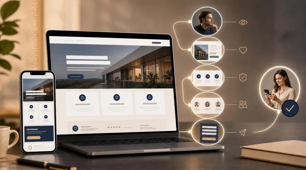
Your website supports inquiries when visitors instantly understand the offer, trust signals and next step.
Published: · Updated:
 © Velvionix
 Key Takeaways
Why the First Seconds Matter So Much
A website is not read first. It is judged first. Visitors check very quickly whether the presence feels familiar, relevant and usable. Only then do they decide whether to read deeper, compare or get in touch.
For freelancers and small businesses, this is especially important. A compact, professionally built foundation can be entirely sufficient and start with a manageable budget. It does not need to look like a large corporate portal. But it does need to communicate immediately: I am in the right place, the offer fits my problem, and getting in touch feels safe.
The problem on many websites is not an unattractive design, but a lack of clarity. A reasonably modern page can still fail to convince if the value appears too late, the contact path is hidden or the design demands more attention than the service itself.
What the First View Must Answer
The first visible part of your website should answer four questions: What do you offer? Who is it for? What result can the customer expect? What is the next step? If one answer is missing, visitors start searching. That extra effort can weaken confidence.
If your service is simple, a direct message is enough. If your service needs explanation, the entry point must be even clearer. Visitors do not need every detail immediately. But they need to understand why it is worth reading on.
If your website addresses several audiences or services, prioritize. The homepage is not an archive. It is a guide. It should make the most important decisions visible and then lead to suitable subpages.
Design Sells When It Creates Orientation
Design matters, but differently than many assume. It is not about being as eye-catching as possible. Research on first impressions shows that visual complexity and familiar patterns play a strong role. Too much visual noise feels tiring. Too unusual a pattern feels risky. Familiar structure helps people understand faster.
For service providers, that means clear headings, calm spacing, readable copy, real images, visible contact options and navigation labels people understand. A professional impression appears when form and content work together.
Suitable images or a finished design concept do not need to exist before the project starts. Velvionix develops a visual direction with you; optional images, illustrations, videos, animations or interactive elements can be planned within the project scope. The Design, Media and Interaction service page explains these options.
If design decisions are made only by personal taste, the website can sell less effectively. A font, effect or image can be attractive and still distract. What matters is whether visitors quickly understand why your business is the right fit for them.
Trust Needs Proof, Not Claims
Words like “competent”, “reliable” or “individual” are easy to write but rarely convincing. Trust comes from verifiable cues. Show who is behind the offer. Explain the process briefly. Name concrete services. Show examples, references or real insights into your work.
If you are just starting and have few references, you still need proof. That can be work samples, clear process descriptions, qualifications, real photos or understandable before-and-after examples. What matters is that visitors see not just a promise, but orientation.
Contact information is also a trust signal. A website that hides contact feels cautious or unfinished. A website that clearly explains how inquiries or appointments work reduces risk.
One Page, One Main Decision
Many websites make enquiries harder because every page tries to do too much at once. Newsletter, appointment, download, first call, social media, blog, quote, callback. If everything looks equally important, nothing is truly important.
Decide which main action makes sense for each page. On a service page, that may be an inquiry. On a contact page, it may be the form. On a reference page, it may be the next matching service area. Secondary actions may exist, but they must not overpower the main decision.
If visitors should act quickly, make the next step visible. If visitors need trust first, guide them through proof and process toward it. A good website does not force. It makes the sensible decision easy.
Practical Example: Beauty Studio With an Unclear Booking Path
Imagine a small beauty studio. Its website looks pleasant, but the most important services are buried in paragraphs. Prices appear in different places, real photos are almost missing and the booking process becomes clear only on the contact page.
A sensible revision would explain the three main services directly. The first section could show clearly who the studio is for. The contact page could explain how appointment booking and replies work. Real images and short service descriptions would replace generic statements. The aim is not a guaranteed increase in inquiries, but better orientation before contact.
How to Keep the Website Clear and Current
A professional presence is not a one-time project. Offers change, prices are adjusted, opening hours shift, new examples appear and old statements lose accuracy. Without regular review, the website can gradually lose clarity and become outdated.
The effort does not need to be large. A lean presence is easy to maintain when content has clear jobs. A short regular check is often enough: are offer, contact path, opening hours, references and key statements still accurate? If not, improve them deliberately.
The most economical website is rarely the one with the most effects. It is the one that stays understandable and gives visitors enough confidence within a few seconds to take the next step.
What weakens the first impression
Common Questions About Website Impact
What must a website achieve in the first seconds?
It must show what is offered, who it is for, why it is trustworthy and which step follows.
Does a website need to be especially creative?
No. For service providers, clarity, credibility and easy contact matter more than unusual effects.
How much copy belongs on the homepage?
Enough for orientation and trust. Details belong where visitors expect them, such as on service pages.
Do I need references if I am just starting?
Real references are ideal. If they are missing, work samples, clear processes, qualifications and understandable examples help.
Why do visitors bounce so quickly?
Usually because relevance or trust are not clear quickly enough. An unclear structure can make the website feel risky or unreliable.
Is a business-card website enough?
A compact website can be enough when it communicates the offer, trust and contact path clearly. The deciding factor is not the number of pages, but whether prospects understand the next step with confidence.
Check Your Current Presence or Start Clean
If you already have a website, the free Velvionix website check provides an initial technical orientation for one public URL. Compare those findings with the questions in this article. The check requires no login and does not store a report.
If you would rather begin with a clear new foundation, our website creation page explains how we build a compact professional presence from scratch. This keeps the entry affordable and manageable while leaving room for later extensions.
Sources
Notice: The respective providers or operators are solely responsible for the content of external links.
- [1] Nielsen Norman Group : "First Impressions Matter: How Designers Can Support Automatic Cognitive Processing"
https://www.nngroup.com/articles/first-impressions-human-automaticity/ - [2] Nielsen Norman Group : "Information Scent: How Users Decide Where to Go Next"
https://www.nngroup.com/articles/information-scent/ - [3] Nielsen Norman Group : "Trustworthiness in Web Design: 4 Credibility Factors"
https://www.nngroup.com/articles/trustworthy-design/ - [4] Alexandre N. Tuch et al. : "The role of visual complexity and prototypicality regarding first impression of websites"
https://research.google/pubs/the-role-of-visual-complexity-and-prototypicality-regarding-first-impression-of-websites-working-towards-understanding-aesthetic-judgments/ - [5] Stanford University : "The Web Credibility Project: Guidelines"
https://credibility.stanford.edu/guidelines/ - [6] Nielsen Norman Group : "Minimize Cognitive Load to Maximize Usability"
https://www.nngroup.com/articles/minimize-cognitive-load/


Comments
No comments yet.
Be the first to comment!
Write a comment
To write a comment, please enable the comment function in your privacy settings.
Write a comment