Convincing in Seconds: How Your Website Wins Inquiries
2026-01-28

This image is protected by copyright. Use only with explicit permission.
© 2026 Velvionix

Key Takeaways
Why “Good Enough” Isn’t Enough
Many websites from freelancers and small businesses look “good enough” at first glance. That’s rarely sufficient. Prospects decide in seconds whether to stay or leave - not out of impatience, but because they want to avoid risk. If your presence looks like a side project, an inquiry feels like an unnecessary gamble.
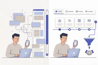
The second typical mistake: The website tries to be everything at once. Homepage as business card, portfolio, blog, and service catalog. Result: Nothing is clear enough. Visitors have to guess what you actually offer, who it’s for, and what the next step looks like. Those who have to guess leave.
And even if your service is excellent: If copy, images, and structure don’t align, a quiet doubt emerges. You’ll only recapture that doubt later in conversation with difficulty - usually with additional time, more explanations, and price pressure.
What Your Website Must Answer in the First Seconds
A professional presence doesn’t start with a logo or colors, but with a simple decision: What question should your website answer in the first seconds? For freelancers and small businesses, it’s almost always this: “Can I quickly get clarity here - and do I trust this person or company to solve my problem?”
If your homepage doesn’t immediately say what you offer, who it’s for, and what results customers can expect, then the first decision goes against you. Phrase the benefit so an outsider understands it without thinking. No buzzwords, no self-description, no “We love quality.” People don’t buy your enthusiasm - they buy security.
If you offer higher-priced services or want to win more appointments, you need proof - otherwise your price looks like a risk. Proof isn’t just client logos. Proof is short, concrete examples: “What was before, what’s better after, and how can you tell?” That could be a before-after glimpse; a few sentences about results; a small selection of references; or a clear process showing you work in a structured way.
One Main Action Per Page
If your website offers many paths, none gets used. The next step must be clear. Decide on one main action per page: request appointment, callback, request quote, or contact. Everything else distracts. A good website isn’t the one with the most options, but the one with the clearest guidance.
If you primarily want to win local customers, understandability and trust matter more than “creativity.” A hairdresser, studio, or practice doesn’t need a show - they need a presence that immediately looks serious, explains services clearly, and makes the path to an appointment easy. Anyone who first has to search whether there are available appointments or where to inquire is already mentally with the next provider.
Case Study: Beauty Studio with Unclear Booking Path
A small beauty studio had a visually nice website, but without clear offerings and no visible booking path. After a redesign, the three most important services stood directly understandable on the homepage, plus real photos, clear “from” prices, and a contact page explaining how booking works. The number of clicks barely changed - but inquiries became noticeably more specific and better fitting, because visitors understood beforehand what they would get.
Three Pragmatic Decisions for Quick Results
Three pragmatic decisions help you find leverage without a big project. If your target customers need to decide quickly, focus on a clear homepage with a value promise and an obvious next step. If you sell more complex services, explain your process in simple words so the customer gains confidence. If your website needs frequent updates, keep structure and content deliberately lean so maintenance stays realistic.
The Real Effort - Unvarnished
About effort, without sugarcoating: A professional presence isn’t “done once.” It thrives on content staying current; offers not becoming outdated; references keeping up; opening hours, contact paths, and statements remaining accurate. If you don’t plan time for this, the website gradually becomes mediocre again. Better a lean, well-maintained website than a big construct that’s already wrong after three months.
What Costs Trust
Common Questions About Website Impact
What does "professional" mean for a website specifically?
Understandable, consistent, maintained, and oriented toward decisions. Visitors must quickly recognize if your offering fits and how to reach you.
Does the website need to be particularly creative to stand out?
No. For service providers, clarity, calm, and credibility count. Creativity without orientation costs trust.
How much text belongs on the homepage?
Enough that value, offerings, and next step are clear. Details belong on subpages, not in the first view.
Do I need references when I'm just starting?
Real examples are ideal. If that's not possible yet, concrete work samples, clear processes, and verifiable statements about results help.
Why do visitors bounce so quickly?
Because they decide in seconds if it fits. Unclear value, too much distraction, or a restless appearance feels like risk.
Is a "business card website" enough?
Only if you don't expect inquiries from it. Anyone wanting to win appointments and projects needs guidance, proof, and a clear contact path.
How often do I need to maintain the website?
Whenever offers, prices, hours, or focus areas change. Plus a brief regular check whether everything still matches.
Improve Your Presence Now
If you want to solve this topic properly, we implement it as part of our services in a structured way - not as a loose individual measure. Please use the contact form and select the appropriate options. We will get back to you with a brief assessment of the most sensible approach.
Sources
Disclaimer: The operators of linked pages are solely responsible for their content. We assume no liability for linked content. This article was created with the assistance of AI-powered research and writing tools.
- [1]
- [2]
- [3] Google Research : "The role of visual complexity and prototypicality regarding first impression of websites"
https://research.google/pubs/the-role-of-visual-complexity-and-prototypicality-regarding-first-impression-of-websites-working-towards-understanding-aesthetic-judgments/ - [4] Google : "Page Experience in Google Search"
https://developers.google.com/search/docs/appearance/page-experience - [5] W3C : "Web Content Accessibility Guidelines (WCAG) Overview"
https://www.w3.org/WAI/standards-guidelines/wcag/
Related Articles

This image is protected by copyright. Use only with explicit permission.
© 2026 Velvionix
Fewer Follow-Ups, More Appointments: FAQ Content That Really Helps
2026-01-30
This image is protected by copyright. Use only with explicit permission.
© 2026 Velvionix
One-Pager or Clear Structure: Why Multiple Pages Often Sell Better
2026-02-02
This image is protected by copyright. Use only with explicit permission.
© 2026 Velvionix
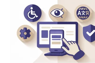
Accessibility That Helps Everyone: Usable, Credible, More Inquiries
2026-02-02
Comments
No comments yet.
Be the first to comment!
Write a comment
To write a comment, please enable the comment function in your privacy settings.
Write a comment