One-Pager or Clear Structure: Why Multiple Pages Often Sell Better
2026-02-02
This image is protected by copyright. Use only with explicit permission.
© 2026 Velvionix
Key Takeaways
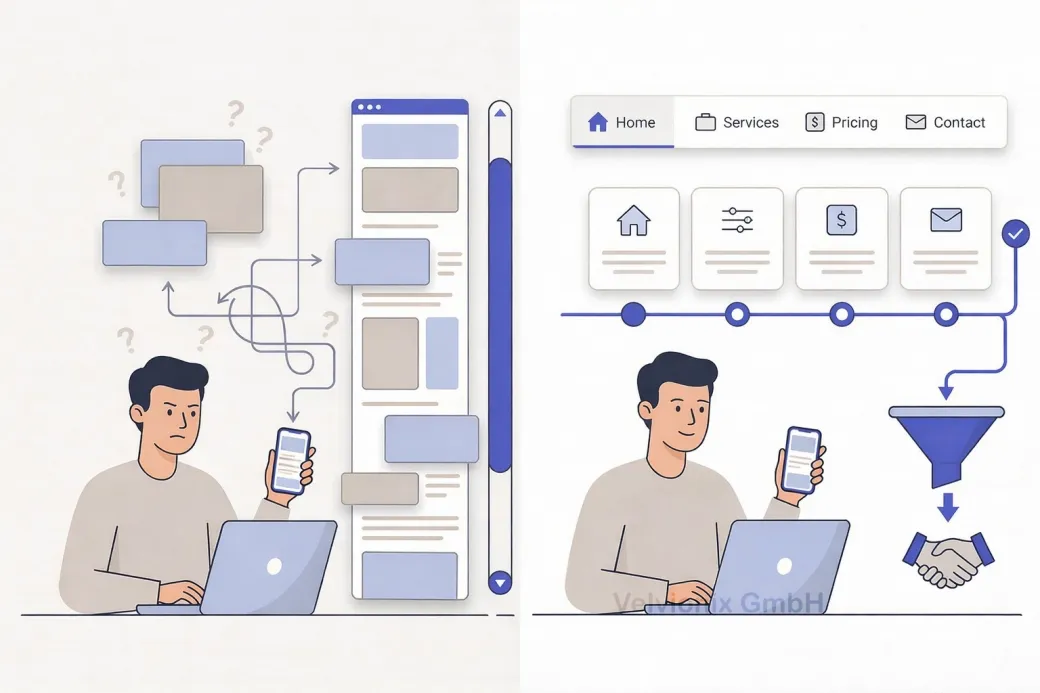
Why One-Pagers Often Lose Inquiries
Imagine: a potential customer lands on your website. They scroll, scroll more, scroll even more. Somewhere between “About Us,” “Services,” and “Contact,” they lose orientation. Where were the prices again? Which service fits their problem? They click away. A missed inquiry.
This situation isn’t coincidence. One-pagers look modern and clear at first glance - everything on one page. But as soon as decisions are involved, the downside shows: those who search must remember. Those who must remember become uncertain. And uncertainty is the most common reason why people don’t inquire.
Add to this: many one-pagers get longer over time. First one more section, then an additional offering, later references, then frequently asked questions. In the end, you have a page that feels like a construction kit - and the most important information is exactly not findable when the customer needs it.
How Clear Structure Makes Decisions Easier
The purpose of your website isn’t that someone has “seen everything.” The purpose is that someone feels confident and takes the next step. For exactly this, a clear structure is often superior because it creates orientation and relieves the mental load.
Multi-page websites don’t sell better because they have “more content.” They sell better because they separate tasks. One page briefly explains what it’s about. One page explains services. One page builds trust. One page makes contact easy. This separation isn’t bureaucracy - it’s clear user guidance.
When Which Structure Fits
If your offering has multiple services or customers first need to understand which service fits their problem, then a one-pager is usually the wrong form because everything drowns in one continuous text flow. Then you need separate pages so each service is explained clearly, calmly, and comprehensibly. This reduces follow-up questions and leads to better-fitting inquiries.
If your target audience needs to decide quickly, then findability is crucial. Clear navigation and short pages ensure visitors can jump purposefully: directly to prices, directly to process, directly to contact. With a one-pager, everything depends on scrolling and anchor links that many barely use on smartphones.
If you have only a single offering and the decision path is very short, then a one-pager can work. But then it must really stay lean: clear message, few sections, one obvious next step. As soon as you notice you want to explain, justify, compare, and address multiple target groups, the one-pager approach is over.
What Makes a Good Structure
A structured website doesn’t have to be large. Often five to seven pages suffice if each page has a clear task: home, services, examples or references, about me, contact, required pages. That’s manageable, looks professional, and can be maintained.
Case Study: Coach with Too-Long One-Pager
A coach had a one-pager that contained everything: introduction, services, prices, process, references, contact. Prospects frequently asked which service fits them and why the prices are what they are. After the rebuild, there was a clear service overview and for two offerings each a separate page with target group, process, and result. Visitor numbers stayed similar, but inquiries became more concrete and faster ready for decision because orientation was better.
The Real Effort - Unvarnished
More pages don’t automatically mean more work if the structure is cleanly planned. A one-pager may seem “simple,” but in maintenance it often becomes more strenuous because every change in one place shifts the overall picture. A structured website can be updated more precisely because you can touch content separately without destroying the whole flow. The effort doesn’t come from page count but from lack of clarity and overload.
What Costs Orientation and Inquiries
Common Questions About One-Pager vs. Structure
When does a one-pager make sense?
When you have a very clear, single offering and the decision path is short, for example a specific service with few variants.
Why do one-pagers often lose inquiries?
Because important information is hard to find. Visitors must scroll and remember where something was. That creates uncertainty.
Does multi-page automatically mean more complicated?
No. Multi-page mainly means: clear tasks per page. That often feels calmer and is easier to understand.
How many pages does a small website need to start?
Often five to seven pages suffice: home, services, examples or references, about me, contact, required pages.
What if I have multiple services but want to keep everything short?
Then you need a clear overview and few, targeted subpages for the most important services. Short is good, but not at the cost of orientation.
Don't anchor links in a one-pager work as a solution?
Partially, but in practice many visitors don't use them consistently, especially on smartphones. A real page structure is more robust.
What's the biggest advantage of a clear structure?
It leads faster to decisions: visitors find specifically what they need and get to the inquiry or appointment more easily.
Create Structure Now Instead of Making Visitors Scroll
If you want to solve this topic properly, we implement it as part of our services in a structured way - not as a loose individual measure. Please use the contact form and select the appropriate options. We will get back to you with a brief assessment of the most sensible approach.
Sources
Disclaimer: The operators of linked pages are solely responsible for their content. We assume no liability for linked content. This article was created with the assistance of AI-powered research and writing tools.
- [1]
- [2] Nielsen Norman Group : "Scrolling and Attention"
https://www.nngroup.com/articles/scrolling-and-attention/ - [3] Nielsen Norman Group : "Information Foraging"
https://www.nngroup.com/articles/information-foraging/ - [4] Stanford University : "The Web Credibility Project: Guidelines"
https://credibility.stanford.edu/guidelines/ - [5] Google : "Creating helpful, reliable, people-first content"
https://developers.google.com/search/docs/fundamentals/creating-helpful-content
Related Articles
This image is protected by copyright. Use only with explicit permission.
© 2026 Velvionix
Fewer Follow-Ups, More Appointments: FAQ Content That Really Helps
2026-01-30

This image is protected by copyright. Use only with explicit permission.
© 2026 Velvionix
Convincing in Seconds: How Your Website Wins Inquiries
2026-01-28
This image is protected by copyright. Use only with explicit permission.
© 2026 Velvionix
Start Professionally: Email, Calendar, and Files That Build Trust
2026-02-04
Comments
No comments yet.
Be the first to comment!
Write a comment
To write a comment, please enable the comment function in your privacy settings.
Write a comment