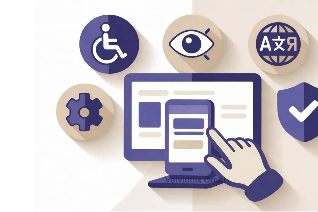
Accessibility That Helps Everyone: Usable, Credible, More Inquiries
2026-02-02
This image is protected by copyright. Use only with explicit permission.
© 2026 Velvionix
Key Takeaways
Why Good Websites Lose Inquiries
Many websites lose inquiries not because of poor services, but because of unnecessary barriers. Text is too small, contrasts too weak, buttons hard to hit, forms confusing. This doesn’t just affect people with disabilities. It affects everyone who’s on the go, tired, has a poor display, or wants to decide quickly.
The problem is often invisible because the website “works” for its creator. Those with good vision who use a mouse and have time get through. But in reality, visitors come with smartphones, with little patience, and with very different prerequisites. When they fail, they don’t reach out. They leave.
And this is exactly where accessibility isn’t “nice to have” but economical. It reduces support queries, prevents drop-offs, and ensures information reliably gets through. That’s the difference between “nicely made” and “works and brings inquiries.”
What Accessibility Really Means
Accessibility means people can use your website even with limitations or assistive devices - and that content is understandable without guessing. This sounds big, but in practice it’s usually pragmatic: better readability, better structure, better usability.
The first step is seeing accessibility as part of the first impression. A website that’s calm, clear, and easy to use appears credible. A website that’s “finicky” feels like risk. Nobody wants risk when booking an appointment or sending an inquiry.
Therefore, start where decisions are made: services, prices or price ranges, process, contact. These are exactly the points where most drop-offs occur. Not because people are “too lazy,” but because barriers quickly look like negligence.
Four Decisions for Better Usability
If your website is meant to win inquiries or appointments, then contact and forms must work without barriers - otherwise everything else is secondary. This means: required fields are clear, error messages are understandable, and the visitor knows immediately what happens after they submit.
If you only convey information in images or graphic elements, then you lose people who don’t perceive images well or have content read aloud. Then the crucial information also needs to be on the page as text - and images shouldn’t be the only carrier of important content.
If your texts are small, gray, or “stylish” but hard to read, then you pay with drop-offs. Then: readability before aesthetics. Large enough fonts, clear lines, and sufficient contrast aren’t a design question but a usability question.
If you have navigation that only works on hover or only “somehow,” then you lose visitors on touch devices and people who can’t click precisely. Then you need clear, simple controls that can be hit - without requiring concentration.
Three Levels of Accessibility
In practice, this can be thought of in three levels without getting technical:
First: Content must be quickly graspable. You achieve this through clear headings, short paragraphs, and a structure where you can jump specifically. People don’t read online like in a book. They scan. Accessibility supports exactly this behavior.
Second: Controls must be reliable. This affects buttons, forms, navigation, and everything clickable. The user should never have to guess whether something is clickable, where it leads, or whether an action worked.
Third: Trust comes from consistency. When one page is “differently” usable than the next, it feels unprofessional. Accessibility is thus also quality management: fewer surprises, fewer special cases, less frustration.
Case Study: More Complete Appointment Requests
A small practice had a website where the appointment path existed but was hard to use on mobile: small buttons, unclear required fields, error messages without explanation. After a revision with clear structure, better readability, and a simplified form, follow-up queries decreased significantly. Above all, more complete appointment requests came in because fewer people got stuck along the way.
The Real Effort - Unvarnished
If you want to approach the topic systematically, recognized guidelines like WCAG help as orientation - these are established recommendations for what “good usability” means. You don’t need to memorize standards. What matters is starting with pragmatic prioritization and removing the most important barriers rather than getting lost in details.
Realistic about the effort: Accessibility isn’t “once and done.” Every content change can introduce new barriers, for example through new images without meaningful context, new text with poor readability, or new form elements. Therefore plan a simple rhythm: briefly check after major changes whether contact, navigation, and central pages still work cleanly; additionally, skim through and test on smartphone at fixed intervals. That’s manageable - but only if you understand it as ongoing maintenance.
What Undermines Accessibility
Frequently Asked Questions About Accessibility
What does accessibility bring if my customers surf "normally"?
"Normal" doesn't exist. People surf mobile, under time pressure, with different devices and abilities. Accessibility reduces barriers for everyone.
Do I need to rebuild the entire website for this?
Usually not. The biggest effects often come from a few improvements to structure, readability, forms, and controls.
How do I recognize if my website has barriers?
Watch for typical signals: frequent follow-up queries, drop-offs in the contact form, complaints about readability, and problems on smartphones.
Is accessibility only a topic for large companies?
No. Small providers especially benefit because fewer follow-up queries arise and the appearance immediately seems more professional.
Which areas are most important?
Everything that leads to a decision: services, prices or price ranges, process, contact, appointments, and forms.
Will I lose the "modern" feel in design through accessible design?
No. Accessibility doesn't mean boring, but clear and usable. That can look very high-quality.
How do I keep the topic stable in everyday life?
With a simple process: briefly check after changes whether contact path, navigation, and readability are still clean, instead of leaving everything for years.
Implement Accessibility the Right Way
If you want to solve this topic properly, we implement it as part of our services in a structured way - not as a loose individual measure. Please use the contact form and select the appropriate options. We will get back to you with a brief assessment of the most sensible approach.
Sources
Disclaimer: The operators of linked pages are solely responsible for their content. We assume no liability for linked content. This article was created with the assistance of AI-powered research and writing tools.
- [1]
- [2]
- [3]
- [4] European Commission : "European Accessibility Act (EAA)"
https://commission.europa.eu/strategy-and-policy/policies/justice-and-fundamental-rights/disability/european-accessibility-act-eaa_en
Related Articles
This image is protected by copyright. Use only with explicit permission.
© 2026 Velvionix
Fewer Follow-Ups, More Appointments: FAQ Content That Really Helps
2026-01-30

This image is protected by copyright. Use only with explicit permission.
© 2026 Velvionix
Convincing in Seconds: How Your Website Wins Inquiries
2026-01-28

This image is protected by copyright. Use only with explicit permission.
© 2026 Velvionix
Multilingual Websites: When They Actually Bring More Inquiries
2026-02-04
Comments
No comments yet.
Be the first to comment!
Write a comment
To write a comment, please enable the comment function in your privacy settings.
Write a comment