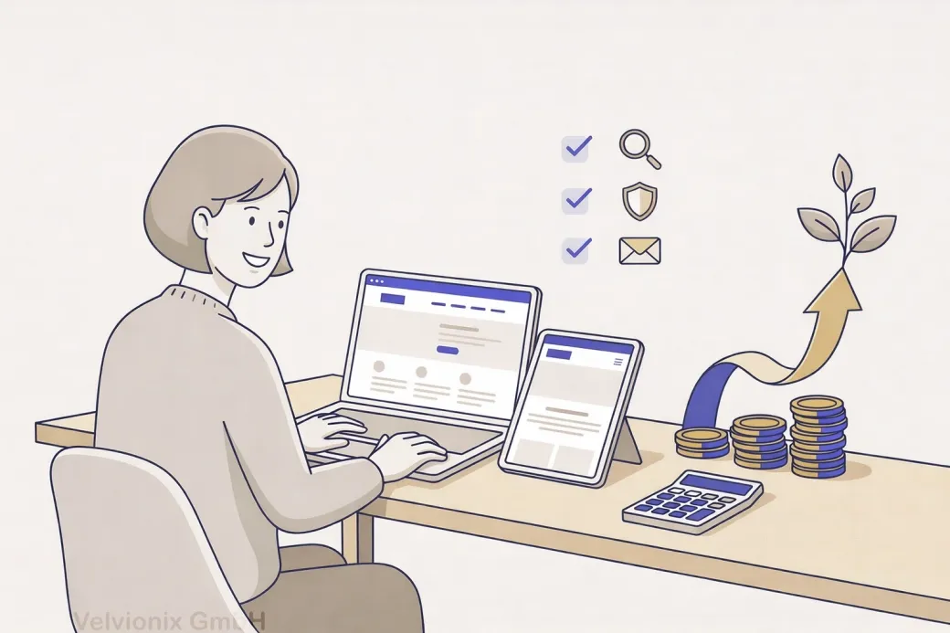
Professional Presence: How to Build a Website That Pays Off
2026-02-03
This image is protected by copyright. Use only with explicit permission.
© 2026 Velvionix
Key Takeaways
Why “Professional” Doesn’t Have to Mean “Expensive”
Many freelancers and small businesses automatically associate “professional” with “expensive.” This leads to two bad decisions: Either waiting too long until something solid is finally possible. Or spending money on appearance while content, structure, and contact path remain weak.
You see the result daily: beautiful site, but unclear what it stands for. Many offerings, but no focus. Texts that sound friendly but say nothing concrete. And in the end, you wonder why inquiries are missing or you mainly get price-comparison requests.
There’s also an underestimated point: A website doesn’t just cost at launch. It costs in operation. Every unnecessary feature, every additional service, every overloaded structure makes maintenance more expensive and creates more “small construction sites” that pile up in daily life.
What Makes a Website That Pays Off
A website that pays off is one that makes decisions easier. People don’t come to your site to admire art. They come to quickly check: Does this fit? Does this look trustworthy? How do I get to the next step without effort?
Spend Your Budget Wisely: Impact Over Appearance
The most important budget principle is uncomfortable but true: You’re not buying a “website.” You’re buying clarity, trust, and a clean path to inquiry or appointment. Everything that doesn’t support this goal is luxury, even if it looks slick.
If your budget is tight, then invest first in the three things that almost always have the biggest effect: a clear homepage, an understandable services page, and a contact page that makes the next step easy. That’s enough to look serious and not lose inquiries.
If you work locally and appointments are the core, then the path to appointment must be crystal clear: understand service, feel trust, request appointment. Every additional distraction on this path costs you real customers.
If you offer services that need explanation, then you don’t need long texts - you need precise statements: for whom, what problem, what result, how it works. The more concrete you are, the less the right customers feel compelled to “compare first.”
Fewer Pages, But the Right Pages
Many pages aren’t automatically better. Often they just make things confusing, and you end up maintaining ten subpages halfheartedly. A profitable website starts lean and strong.
A sensible set is usually: homepage, services, about us/me, references or examples, contact, required pages. This isn’t minimalism ideology - it’s prioritization. Those who need more add later deliberately, instead of overloading from the start.
Search engine optimization means: being found better when people search for your services. For this, it’s more important that your content is clear and matches real search queries than that you publish many pages without substance.
Trust Isn’t a Design Trick - It’s Proof
Trust comes from details that look like real work: real photos instead of interchangeable images; understandable examples instead of “we are reliable”; clear statements instead of fog. This doesn’t necessarily cost much money, but it costs attention.
If you don’t have big references, then show work samples or typical cases that make your work tangible. This is often more valuable to visitors than a long resume. Important: It must look real and fit your daily work.
Case Study: Studio with Small Budget
A small studio wanted to “finally look professional” but had barely any budget. Instead of a complete rebuild, homepage, service descriptions, and contact page were redone, plus real photos from the studio and two short examples of how an appointment works. Afterward, there weren’t suddenly twice as many visitors, but inquiries were noticeably more fitting because prospects understood faster what they would get.
Reducing Ongoing Costs: What You Don’t Build, You Don’t Have to Maintain
The biggest budget killer isn’t the first two weeks - it’s the next two years. Every additional integration can fail, change, or require new maintenance. The more building blocks involved, the more frequent small disruptions that cost you time in daily life.
If you only add something “nice to have” because it looks modern, leave it out. If it doesn’t directly contribute to inquiries, appointments, or trust, it rarely justifies the ongoing costs.
The Real Effort - Unvarnished
Realistic about effort: Even a lean website needs maintenance. Content must stay current, opening hours or offerings must be accurate, contact paths must work. The difference is that this maintenance stays predictable and isn’t constantly interrupted by technical surprises. A website that pays off is one that runs reliably and can be adapted without drama.
What Endangers Budget and Impact
Common Questions About Budget-Friendly Websites
Does a professional website have to be expensive?
No. It often gets expensive through wrong priorities and ongoing costs. With focus on clarity and trust, you can achieve a lot with a manageable budget.
What brings the most impact if I can only invest a little?
Homepage, services page, and contact page. If these three are solid, the website immediately looks more serious and loses fewer inquiries.
How many pages do I need to start?
Few but strong. Better six pages that work than twenty that are half-maintained.
What's the most common reason websites don't pay off?
Unclear value and no obvious next step. Visitors don't know if it fits and how to inquire.
Should I improve design or text first?
Both are connected, but text and structure decide first. Beautiful design can't save unclear content.
How can I build trust when I have few references?
With real examples, clear processes, and concrete statements. Show tangibly what collaboration looks like and what customers can expect.
How do I keep the website affordable in daily operations?
Stay lean, only use sensible features, and briefly check content regularly. This way you avoid repair costs and unnecessary subscriptions.
Look Professional Now - Without Burning Budget
If you want to solve this topic properly, we implement it as part of our services in a structured way - not as a loose individual measure. Please use the contact form and select the appropriate options. We will get back to you with a brief assessment of the most sensible approach.
Sources
Disclaimer: The operators of linked pages are solely responsible for their content. We assume no liability for linked content. This article was created with the assistance of AI-powered research and writing tools.
- [1] Nielsen Norman Group : "First Impressions Matter: How Designers Can Support Users' Automatic Responses"
https://www.nngroup.com/articles/first-impressions-human-automaticity/ - [2] Stanford University : "The Web Credibility Project: Guidelines"
https://credibility.stanford.edu/guidelines/index.html - [3] Google : "Understanding page experience in Google Search results"
https://developers.google.com/search/docs/appearance/page-experience - [4] Nielsen Norman Group : "Return on Investment for Usability"
https://www.nngroup.com/articles/return-on-investment-for-usability/ - [5] Google : "The role of page experience in creating helpful content"
https://developers.google.com/search/blog/2023/04/page-experience-in-search
Related Articles
This image is protected by copyright. Use only with explicit permission.
© 2026 Velvionix
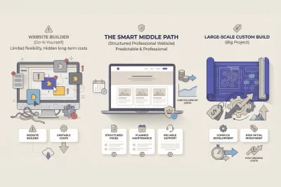
Site Builder or Professional Website: The Path That Pays Off
2026-01-29
This image is protected by copyright. Use only with explicit permission.
© 2026 Velvionix
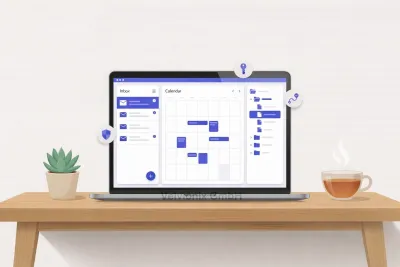
Start Professionally: Email, Calendar, and Files That Build Trust
2026-02-04
This image is protected by copyright. Use only with explicit permission.
© 2026 Velvionix
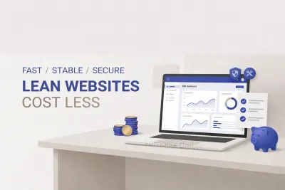
Maintenance, Security, Peace of Mind: Why Lean Websites Cost Less
2026-02-04
Comments
No comments yet.
Be the first to comment!
Write a comment
To write a comment, please enable the comment function in your privacy settings.
Write a comment